
First you will want to select which snippet you want to edit, after selecting any snippet, you will now have the option of 'Mobile' under the 'Editing' column on the right hand side;
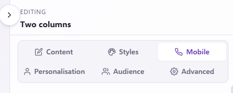
By selecting ‘Mobile’ you will be able to edit how your email will display on smaller screen sizes/resolutions.
There is an option along the top to be able to view your email in a mobile view;

This is where you can see a smaller screen that emulates what the recipient may see when opening on their mobile device.
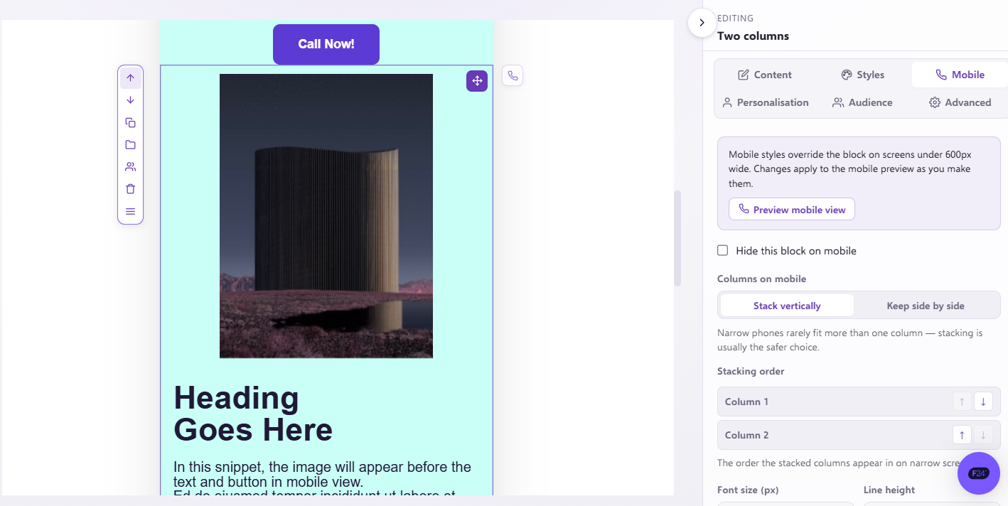
Within this section, you can update font size, the font alignment, line height and padding. By adjusting your settings within this section, it will only apply it to the template for smaller screen sizes (our default preview is 400px width), and not impact the appearance on desktop. For example, your template could be left aligned for desktop, and centrally aligned for smaller screen sizes.