
Related topics: How to edit Mobile View : Force24 Support
This might be useful if you have a larger image as part of the snippet, but want to prioritise the text content in mobile screens - all while keeping the same layout in desktop mode.
For example, in this two-column snippet we've got the image on the left and the text on the right for desktop screens. If we wanted to prioritise the text element in mobile screens, we can do this by first clicking into the Mobile section whilst in the Editing column:
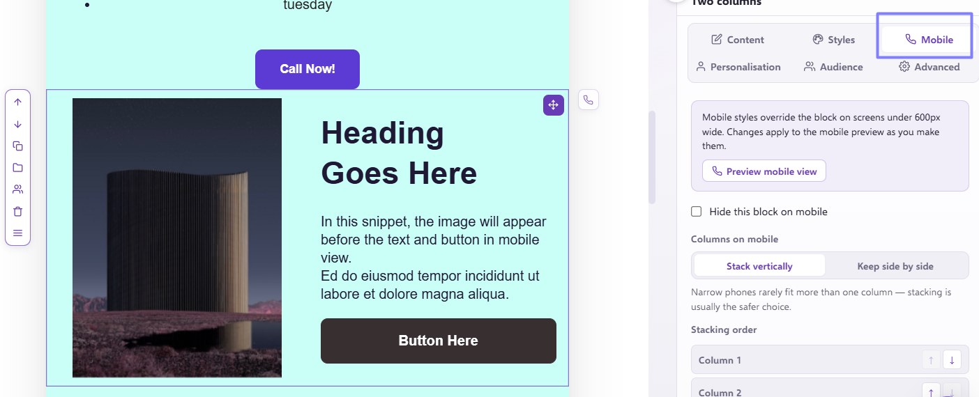
This will bring up the 'Stacking order' options relating to how the columns stack in mobile. For our purposes now, we just need to have Column 2 on top- this means simply to show the second column snippet (as shown in desktop view) above the first snippet in mobile screens, as opposed to the default which would be first on top and second on the bottom. You can change the order of the columns by using the arrows next to the different columns on the right hand side.
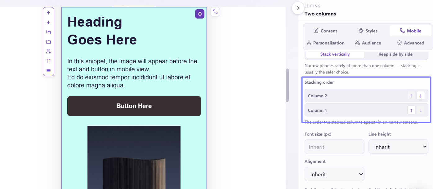
Once clicked, you'll then see the column order change in mobile without impacting the desktop layout:
A great use case for this would be for templates that have a "checkerboard" structure, where there are multiple 2-column snippets that alternate the column order section-to-section e.g.:
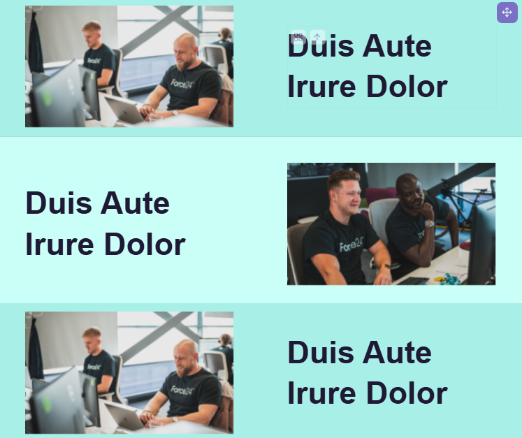
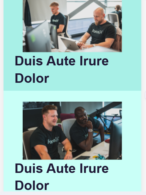
By default, a template like this would read IMAGE/TEXT/TEXT/IMAGE/IMAGE/TEXT etc. in mobile view, throwing off the naturally expected order:
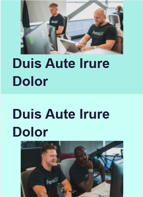
Ideally, this would read IMAGE/TEXT/IMAGE/TEXT... or TEXT/IMAGE/TEXT/IMAGE...
By utilising the "Column 1/ Column 2" option as explained above, the mobile order can be re-configured to achieve this, all without the need for any coding!
If you do have any more bespoke mobile view requirements, please don't hesitate to reach out to our Product Experts via our live chat and they will be happy to assist!